
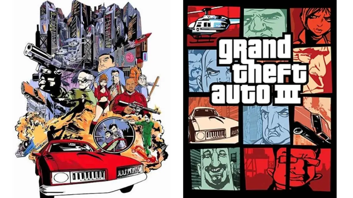
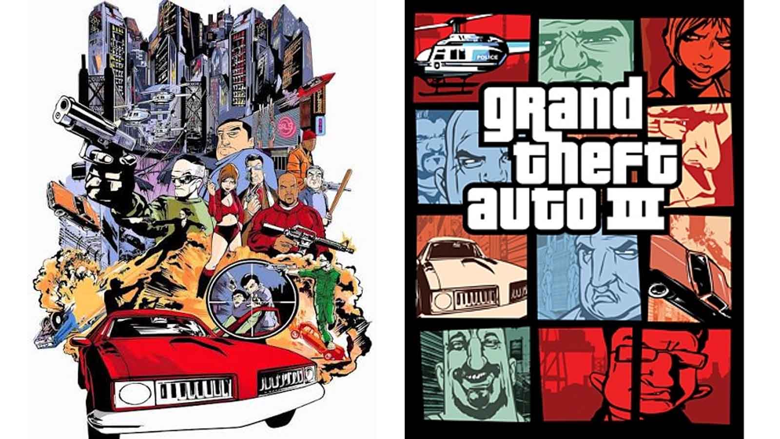
However, the creative process behind this shift is subject to the hazy nature of memory and the differing perspectives of those in the room. While Houser remembers a forty-eight-hour scramble, the artist himself, Stephen Bliss, has offered a slightly different timeline in past accounts. Bliss has reportedly stated that he was given approximately a week to produce the replacement artwork. This discrepancy, while minor in the grand scheme of the franchise’s history, highlights the intense pressure the team was under. Bliss noted that the original "movie poster" cover had taken roughly six months to paint and perfect. To replace a half-year of meticulous work with a new concept in a matter of days is a feat of creative endurance that few in the industry have had to replicate.
The result of this scramble was the "panel" or "comic book" layout. By breaking the artwork into smaller, distinct windows, Rockstar was able to showcase the various elements of the game—the cars, the diverse cast of criminals, and the atmosphere of the city—without relying on a single, potentially provocative action scene. It was a design that felt sophisticated and stylish, evoking a sense of "cool" that was less about explicit violence and more about the lifestyle and vibe of the underworld.
Interestingly, the transition to the new artwork was not universal. While North American audiences received Bliss’s grid-based redesign, the original "action-heavy" collage actually made it to production for the European and UK releases. For many British players who grew up with the game, the original movie-poster style is the one they remember seeing on store shelves. This regional split created a unique situation where two generations of players can remember the exact same game through two completely different visual lenses. It remains a fascinating footnote in gaming history that the very version Rockstar deemed too intense for the American market in late 2001 was the standard edition for players across the Atlantic.
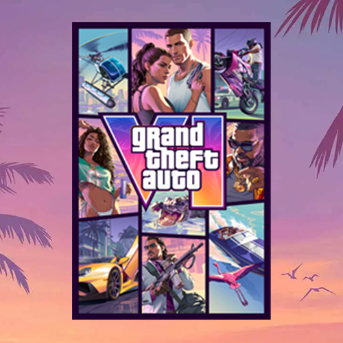
The "grid" style proved to be more than just a temporary fix; it became a flexible graphic design template that allowed Rockstar to maintain brand consistency while evolving the specific aesthetic of each new setting. When the series moved to the 1980s for Grand Theft Auto: Vice City, the panels remained, but they were filled with pastel pinks, sunset oranges, and neon-soaked imagery that perfectly captured the "Miami Vice" influence. For San Andreas, the grid adapted to the 1990s West Coast aesthetic, featuring lowriders and palm trees.
This template has become so ingrained in the series’ DNA that fans now treat the reveal of a new game’s cover art as a major cultural event. Every panel is picked apart for clues about the game’s story, characters, and setting. The logo, too, has maintained a consistent family look, utilizing the "Pricedown" font that has become synonymous with the brand. Even when the franchise moved into the more grounded and gritty territory of Grand Theft Auto IV, the segmented cover art remained, signaling to the audience that despite the tonal shifts, this was still undeniably a Grand Theft Auto experience.