
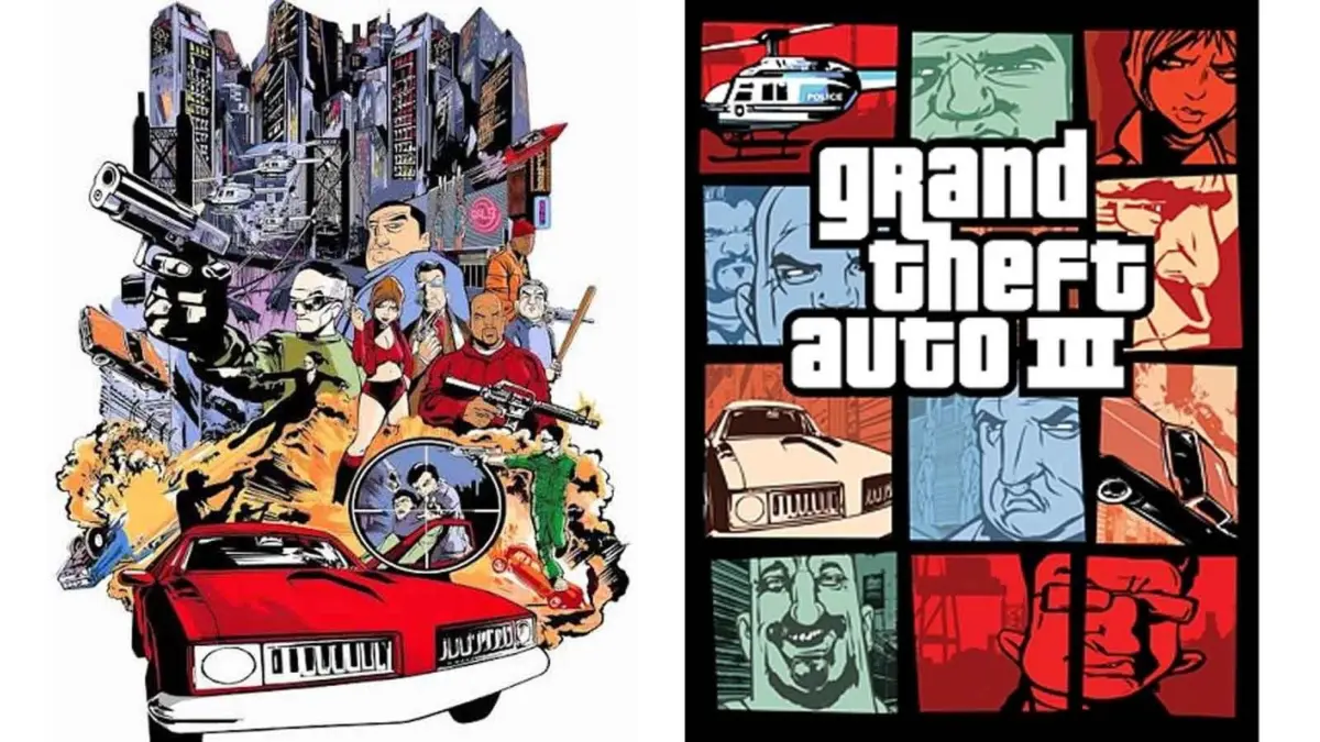
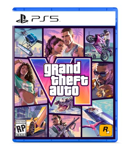
When the official cover art for Grand Theft Auto VI was finally unveiled, the reaction from the global gaming community was instantaneous. Even before the eyes could settle on the stylized "VI" or the palm-fringed logo, there was an immediate sense of recognition. The artwork featured the familiar, fragmented layout that has defined the series for nearly a quarter of a century: a vibrant collage of character portraits, high-end vehicles, and snapshots of a life lived on the edge of the law, all contained within a distinct grid of panels. To the casual observer, it is simply the "GTA look." To the branding expert, it is one of the most successful visual identities in the history of entertainment. Yet, as recent reflections from Rockstar Games co-founder Dan Houser and artist Stephen Bliss remind us, this iconic aesthetic was never part of the original plan. Instead, it was a desperate, last-minute pivot born in the shadow of the September 11 terrorist attacks.
The story of the Grand Theft Auto cover art is a masterclass in how necessity and crisis can occasionally birth a design language that outlasts the very products it was meant to represent. For twenty-five years, this segmented "window" style has served as the calling card for the franchise, but its origins are rooted in a moment of profound cultural sensitivity and a frantic race against a looming release deadline. As Rockstar prepares for the launch of Grand Theft Auto VI, the history of its visual presentation offers a rare look into the internal mechanics of a studio that was, in 2001, on the verge of changing the industry forever.
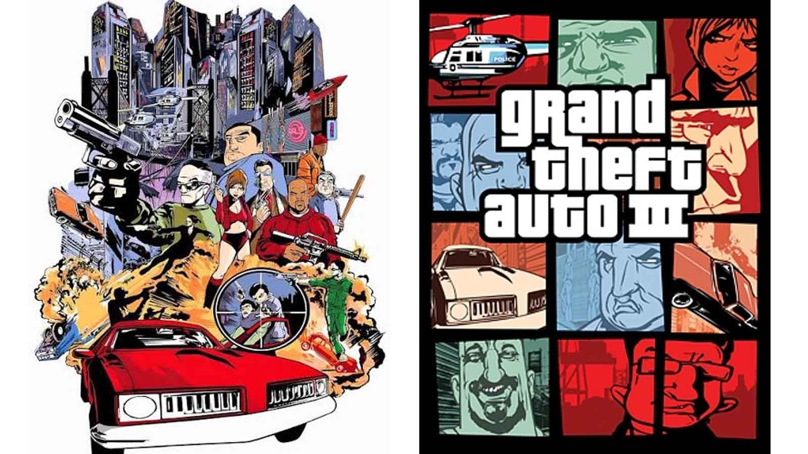
According to Dan Houser, in a recent interview that has revitalized interest in the studio’s early days, the iconic cover art for Grand Theft Auto 3 was a "rush job." At the time, Rockstar was preparing to launch its first 3D entry in the series, a game that would eventually revolutionize the open-world genre. However, as the October 2001 release date approached, the world changed. The attacks on the World Trade Center in New York City—where Rockstar is headquartered—necessitated an immediate re-evaluation of the game’s content and marketing materials.
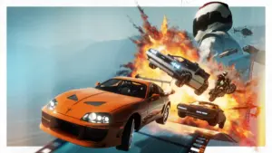
The original cover art for Grand Theft Auto 3 was vastly different from the grid-based design we know today. It was designed to look like a classic, high-octane movie poster, a single, cohesive illustration that leaned heavily into the action-movie tropes of the era. This scrapped artwork featured a blown-up bridge, police officers firing weapons into the air, and helicopters circling overhead. In the immediate aftermath of 9/11, this imagery felt catastrophically "heavy" and insensitive for a game set in Liberty City, a fictionalized version of New York. With only weeks left before the game was scheduled to hit store shelves, Rockstar made the executive decision to ditch the movie-poster concept and start from scratch.
Houser recalls the pressure of that moment with striking clarity. "The cover art that became the iconic GTA cover art; Stephen Bliss did that in about two evenings," Houser told IGN. The idea that a design template used for every subsequent title—from the neon-soaked Vice City to the sprawling San Andreas and the HD-era epics of GTA IV and V—was finalized in a single weekend is a testament to the high-stakes environment of early 2000s game development.
However, the creative process behind this shift is subject to the hazy nature of memory and the differing perspectives of those in the room. While Houser remembers a forty-eight-hour scramble, the artist himself, Stephen Bliss, has offered a slightly different timeline in past accounts. Bliss has reportedly stated that he was given approximately a week to produce the replacement artwork. This discrepancy, while minor in the grand scheme of the franchise’s history, highlights the intense pressure the team was under. Bliss noted that the original "movie poster" cover had taken roughly six months to paint and perfect. To replace a half-year of meticulous work with a new concept in a matter of days is a feat of creative endurance that few in the industry have had to replicate.
The result of this scramble was the "panel" or "comic book" layout. By breaking the artwork into smaller, distinct windows, Rockstar was able to showcase the various elements of the game—the cars, the diverse cast of criminals, and the atmosphere of the city—without relying on a single, potentially provocative action scene. It was a design that felt sophisticated and stylish, evoking a sense of "cool" that was less about explicit violence and more about the lifestyle and vibe of the underworld.
Interestingly, the transition to the new artwork was not universal. While North American audiences received Bliss’s grid-based redesign, the original "action-heavy" collage actually made it to production for the European and UK releases. For many British players who grew up with the game, the original movie-poster style is the one they remember seeing on store shelves. This regional split created a unique situation where two generations of players can remember the exact same game through two completely different visual lenses. It remains a fascinating footnote in gaming history that the very version Rockstar deemed too intense for the American market in late 2001 was the standard edition for players across the Atlantic.
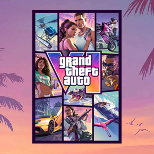
The "grid" style proved to be more than just a temporary fix; it became a flexible graphic design template that allowed Rockstar to maintain brand consistency while evolving the specific aesthetic of each new setting. When the series moved to the 1980s for Grand Theft Auto: Vice City, the panels remained, but they were filled with pastel pinks, sunset oranges, and neon-soaked imagery that perfectly captured the "Miami Vice" influence. For San Andreas, the grid adapted to the 1990s West Coast aesthetic, featuring lowriders and palm trees.
This template has become so ingrained in the series’ DNA that fans now treat the reveal of a new game’s cover art as a major cultural event. Every panel is picked apart for clues about the game’s story, characters, and setting. The logo, too, has maintained a consistent family look, utilizing the "Pricedown" font that has become synonymous with the brand. Even when the franchise moved into the more grounded and gritty territory of Grand Theft Auto IV, the segmented cover art remained, signaling to the audience that despite the tonal shifts, this was still undeniably a Grand Theft Auto experience.
As Rockstar prepares for the release of Grand Theft Auto VI, the studio is leaning heavily into this established nostalgia. The official art for the upcoming title, which is set to return players to the sun-drenched streets of Vice City (now part of the state of Leonida), follows the Bliss-inspired template to the letter. It features the series’ first female protagonist, Lucia, alongside her partner, framed by the familiar vignettes of modern-day Florida life. The art serves as a bridge between the series’ past and its future, proving that a design born from a weekend of crisis management can become a permanent fixture of the cultural landscape.
The legacy of the GTA 3 cover art is a reminder that in the world of high-level creative production, the best ideas aren’t always the ones that are nurtured over months of meetings and focus groups. Sometimes, the most enduring icons are the ones that are forged in the heat of a deadline, when the original plan is thrown in the bin and creators are forced to rely on instinct. What remains is a graphic design masterstroke that has become as iconic as the gameplay it represents.
Beyond the box art, the influence of that 2001 pivot can be seen in the way Rockstar approaches its entire brand identity. The studio has always been one to favor mystery and carefully curated "vibes" over traditional marketing blitzes. The grid layout facilitates this, offering a mosaic of the experience rather than a literal depiction of a single mission. It invites the player to imagine the world inside the box, a strategy that has helped Grand Theft Auto V become one of the best-selling pieces of media in history.
For those looking forward to the next chapter, the wait is nearing its end. Grand Theft Auto VI is currently slated for release on November 19, targeting the latest generation of hardware on the PlayStation 5 and Xbox Series X/S. As the industry looks toward what is arguably the most anticipated video game release of all time, the artwork standing at the forefront of the campaign remains a tribute to a moment twenty-five years ago when a team of artists had to find a new way to show the world what Liberty City was all about. What was once a rushed replacement is now the gold standard of gaming iconography, a visual language that speaks to millions of players before they even press "start."