
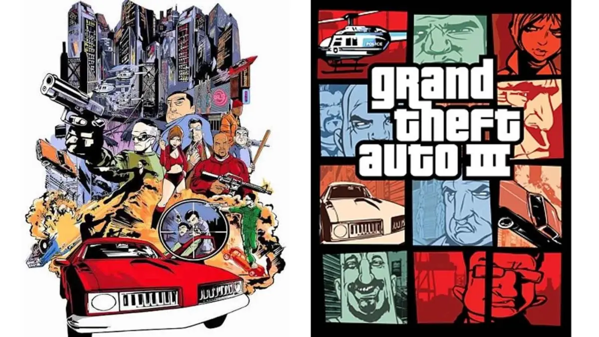
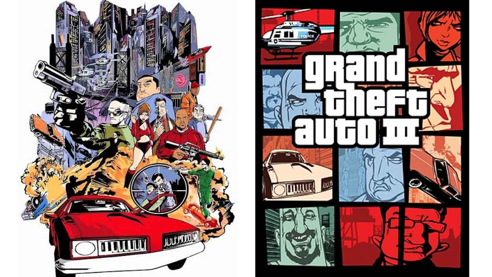
When the official cover art for Grand Theft Auto VI was finally unveiled, the reaction from the global gaming community was instantaneous. Even before the eyes could settle on the stylized "VI" or the palm-fringed logo, there was an immediate sense of recognition. The artwork featured the familiar, fragmented layout that has defined the series for nearly a quarter of a century: a vibrant collage of character portraits, high-end vehicles, and snapshots of a life lived on the edge of the law, all contained within a distinct grid of panels. To the casual observer, it is simply the "GTA look." To the branding expert, it is one of the most successful visual identities in the history of entertainment. Yet, as recent reflections from Rockstar Games co-founder Dan Houser and artist Stephen Bliss remind us, this iconic aesthetic was never part of the original plan. Instead, it was a desperate, last-minute pivot born in the shadow of the September 11 terrorist attacks.
The story of the Grand Theft Auto cover art is a masterclass in how necessity and crisis can occasionally birth a design language that outlasts the very products it was meant to represent. For twenty-five years, this segmented "window" style has served as the calling card for the franchise, but its origins are rooted in a moment of profound cultural sensitivity and a frantic race against a looming release deadline. As Rockstar prepares for the launch of Grand Theft Auto VI, the history of its visual presentation offers a rare look into the internal mechanics of a studio that was, in 2001, on the verge of changing the industry forever.
According to Dan Houser, in a recent interview that has revitalized interest in the studio’s early days, the iconic cover art for Grand Theft Auto 3 was a "rush job." At the time, Rockstar was preparing to launch its first 3D entry in the series, a game that would eventually revolutionize the open-world genre. However, as the October 2001 release date approached, the world changed. The attacks on the World Trade Center in New York City—where Rockstar is headquartered—necessitated an immediate re-evaluation of the game’s content and marketing materials.
The original cover art for Grand Theft Auto 3 was vastly different from the grid-based design we know today. It was designed to look like a classic, high-octane movie poster, a single, cohesive illustration that leaned heavily into the action-movie tropes of the era. This scrapped artwork featured a blown-up bridge, police officers firing weapons into the air, and helicopters circling overhead. In the immediate aftermath of 9/11, this imagery felt catastrophically "heavy" and insensitive for a game set in Liberty City, a fictionalized version of New York. With only weeks left before the game was scheduled to hit store shelves, Rockstar made the executive decision to ditch the movie-poster concept and start from scratch.
Houser recalls the pressure of that moment with striking clarity. "The cover art that became the iconic GTA cover art; Stephen Bliss did that in about two evenings," Houser told IGN. The idea that a design template used for every subsequent title—from the neon-soaked Vice City to the sprawling San Andreas and the HD-era epics of GTA IV and V—was finalized in a single weekend is a testament to the high-stakes environment of early 2000s game development.